
What Are You Really Selling?
Grammar, innuendo and clarity in health-care advertising
I recently saw a billboard for Elysium Primary Care, a clinic serving gay men. It featured a smiling, conventionally attractive man holding two cherries near his mouth and the headline, “We put the cherry on top.” Beneath it was a more straightforward claim: “Atlanta’s Top-Rated Gay Men’s Health Clinic.”
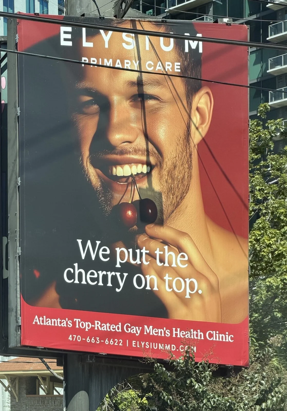
Elysium Primary Care billboard in Atlanta
The ad got my attention. In that sense, it worked.
But I’m a copywriter. I can’t just notice an ad and move on with my life. I have to take apart the words, consider the image, and ask the question every piece of advertising should be able to answer:
What are you really selling?
This is not about sex
Let’s get something out of the way. My reaction is not a judgment about sexuality, sexual expression, or advertising directed toward gay men.
Health-care communication can—and often should—be sex-positive, culturally aware, and free of embarrassment. Suggestiveness is not inherently inappropriate. Humor and innuendo may help a provider signal that patients can discuss intimate subjects openly and without shame.
My question is about clarity.
At face value, “We put the cherry on top” makes a perfectly good customer-service promise. It suggests an extra touch. Care that goes above and beyond. The nearby “top-rated” claim may even reinforce that reading.
But then there are the cherries. And the mouth. And “on top.”
You see where this is going.
Those meanings may be entirely intentional. Some viewers may find the wink playful, culturally fluent, or affirming. But the secondary meanings are far more vivid than the primary one. I remember the innuendo. I’m much less certain what the clinic wants me to believe about its care.
A billboard has one job—or maybe three
A billboard has only a few seconds to answer three basic questions:
Who is this for?
What is being offered?
Why should I choose it?
This one answers the first question unmistakably: it is for gay men. The other two answers are obscured by the copy’s cleverness.
“Top-rated” tells us the clinic is well regarded, but it doesn’t tell us what kind of care or experience earned that distinction. Is the promise exceptional primary care? Specialized clinical knowledge? A more welcoming patient experience? Freedom from judgment?
Any of those would be meaningful.
Instead, the ad leaves a strong impression without leaving an equally clear understanding of the service being promised.
Dating-app vibes
There is also something faintly manipulative about the way the image earns our attention. It borrows the visual language of a dating app: an attractive, flirtatious man presented as an object of interest or aspiration.
Are viewers meant to want him? Want to be him? Hope to meet someone like him at the clinic?
Advertising has always used attraction and aspiration. That is hardly breaking news. Nor is there anything objectionable about portraying a gay man as attractive or sexual.
The issue is the disconnect between the image and the offer.
A surprising gap between image and headline can make for an intriguing, clever twist. Here, it feels as though desirability is standing in for information. The image draws us in, but it doesn’t bring us any closer to understanding the care.
I hesitate to declare the ad disrespectful, particularly as a straight woman looking at advertising created for gay men. I know enough to know that I am not its intended audience. People who are may experience it as funny, affirming, or culturally knowing. Their readings matter in ways mine cannot fully anticipate.
Still, it seems fair to ask whether the ad reflects its audience or reduces that audience to a familiar image of gay male desirability: young, conventionally handsome and sexually suggestive.
A health-care provider should be able to speak openly about sex. But speaking openly about sexuality is different from using sexual desirability as a shortcut for gay identity. One recognizes sexuality as part of whole-person care. The other risks making it the defining characteristic of the patient.
Maybe that is the strategy
Then my teen offered a completely different read: “There’s nothing sexy about health care, so why not romanticize it if you can?”
Fair point.
Maybe the dating-app energy isn’t distracting from the strategy. Maybe it is the strategy. Health care can feel clinical, intimidating, and deeply unsexy. Giving it some glamour could make it more approachable—or even aspirational. If the image helps someone see taking care of themselves as desirable, that is not nothing.
But romanticizing the experience still leaves the advertiser with the job of communicating what that experience actually is.
Attention is not understanding
This may be an effective billboard. It stopped me. I photographed it. Now I’m writing an entire blog post about it. That is considerably more attention than I give most billboards.
In a category filled with sterile stock photography and copy that has apparently been sedated, the ad’s warmth, confidence, and playfulness may be deliberate advantages.
But attention and understanding are different outcomes.
The best provocative advertising creates a moment of surprise and then delivers a sharper message. The provocation is a doorway into the promise. When the audience remembers the device but cannot describe the offer, the device has become the message.
Sexual innuendo is not the problem. Sexuality is not something health-care advertising needs to avoid. The question is whether every creative choice helps the audience understand the care being offered—and why the provider deserves their trust.
If an advertisement leaves people asking, “What are you really selling?” it may begin an interesting conversation. But in health care, the advertiser should have a clear answer.
And then there was this
Not long after seeing the Elysium billboard, I encountered another health-care message that left me asking the same question for a completely different reason:
“America’s #1 HIV Provider.”

AIDS Healthcare Foundation billboard in Atlanta
I’m going to assume the intended claim is “America’s #1 HIV care provider.”
That one missing word makes quite a difference. Without “care,” the organization appears to be claiming that it provides HIV itself.
Not ideal.
The error is almost comical, but it reinforces the larger point. In health-care advertising, a small communication choice can radically change the perceived offer.
These two billboards arrive at that problem from opposite directions. The Elysium ad suffers from a surplus of meaning. The AHF ad suffers from a missing word.
One asks the audience to sort the intended promise from several more vivid associations. The other asks us to supply the language needed to make its claim sensible.
Both get attention. Neither gets complete clarity.
And in health care, clarity should not be something the audience has to provide.